Machine Learning Part 3: Exploratory Data Analysis for Machine Learning
Please Subscribe Youtube| Like Facebook | Follow Twitter
Data Analysis for Machine Learning
In this article, we will delve into various techniques of Exploratory Data Analysis for Machine Learning (EDA) that include data visualization, statistical analysis, and identifying patterns and insights in the data. Python will be used as the programming language to showcase practical examples and their corresponding outputs. Exploratory Data Analysis (EDA) plays a crucial role in the machine learning workflow as it helps to understand and extract meaningful insights from the dataset before building a predictive model.
Data Visualization Techniques
Data visualization is an effective way to gain a visual understanding of the dataset. Python provides several libraries, such as Matplotlib and Seaborn, which offer a wide range of plotting capabilities. Here’s an example code snippet that demonstrates the use of these libraries:
First please download Matplotlib and Seaborn first by running below commands
pip install matplotlib
pip install seaborn
Code
import pandas as pd
import numpy as np
import matplotlib.pyplot as plt
import seaborn as sns

# Generate random dataset
np.random.seed(42)
x = np.random.rand(100)
y = np.random.rand(100)
values = np.random.randint(1, 100, size=100)
categories = np.random.choice(['A', 'B', 'C'], size=100)

# Create a DataFrame
data = pd.DataFrame({'x': x, 'y': y, 'values': values, 'category': categories})

# Save the DataFrame to a CSV file
data.to_csv('dataset.csv', index=False)

# Load the dataset
data = pd.read_csv('dataset.csv')

# Scatter plot
plt.scatter(data['x'], data['y'])
plt.xlabel('X')
plt.ylabel('Y')
plt.title('Scatter Plot')
plt.show()

# Histogram
plt.hist(data['values'], bins=10)
plt.xlabel('Values')
plt.ylabel('Frequency')
plt.title('Histogram')
plt.show()

# Box plot
sns.boxplot(x=data['category'], y=data['values'])
plt.xlabel('Category')
plt.ylabel('Values')
plt.title('Box Plot')
plt.show()
Output
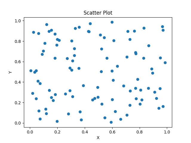
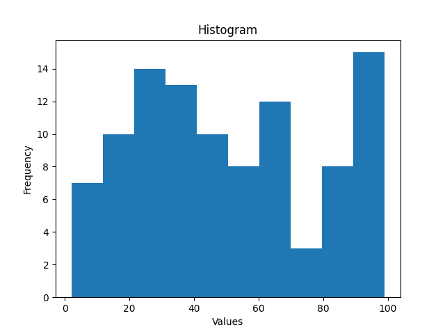
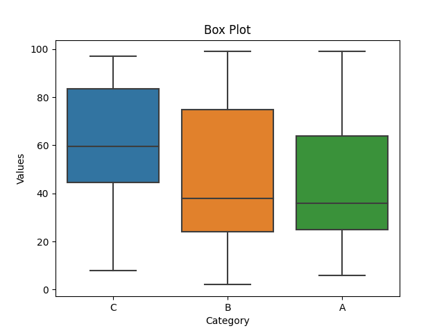
The code provided is a Python script that generates a random dataset, saves it to a CSV file, and then loads and visualizes the data using scatter plots, histograms, and box plots.
- The scatter plot shows the relationship between the variables ‘x’ and ‘y’.
- The histogram provides insights into the distribution of values in the dataset.
- The box plot helps identify the central tendency, spread, and outliers within different categories.
Code Explanation
The code generates random data, creates visualizations, and saves the data to a CSV file. The following steps are executed:
Step 1: Importing the necessary libraries
- The necessary libraries are imported:
- The pandas library is imported as pd for data manipulation.
- The numpy library is imported as np for numerical operations.
- The matplotlib.pyplot library is imported as plt for creating visualizations.
- The seaborn library is imported as sns for enhanced visualizations.
Step 2: Generate random dataset
- A random dataset is generated using the np.random functions.
- Two arrays, x and y, with 100 random numbers between 0 and 1 are created.
- An array, values, with 100 random integers between 1 and 100 is created.
- An array, categories, with 100 random choices from [‘A’, ‘B’, ‘C’] is created.
Step 3: Create a DataFrame
- A DataFrame named ‘data’ is created using the pd.DataFrame function.
- The arrays x, y, values, and categories are combined into a dictionary and passed as the data argument.
Step 4: Save the DataFrame to a CSV file
- The DataFrame is saved to a CSV file named ‘dataset.csv’ using the to_csv method of the data DataFrame.
- The index is set to False to exclude the index column from the CSV file.
Step 5: Load the dataset
- The dataset is loaded from the ‘dataset.csv’ file into the data DataFrame using the pd.read_csv function.
Step 6: Scatter plot
- A scatter plot is created using the plt.scatter function.
- The ‘x’ and ‘y’ columns of the data DataFrame are plotted on the x-axis and y-axis, respectively.
- The x-axis is labeled as ‘X’, the y-axis is labeled as ‘Y’, and the plot is titled as ‘Scatter Plot’.
- The plot is displayed using the plt.show function.
Step 7: Histogram
- A histogram is created using the plt.hist function.
- The ‘values’ column of the data DataFrame is used as the data to create the histogram.
- The number of bins is set to 10.
- The x-axis is labeled as ‘Values’, the y-axis is labeled as ‘Frequency’, and the plot is titled as ‘Histogram’.
- The plot is displayed using the plt.show function.
Step 8: Box plot
- A box plot is created using the sns.boxplot function.
- The ‘category’ column of the data DataFrame is used as the x-axis variable, and the ‘values’ column is used as the y-axis variable.
- The x-axis is labeled as ‘Category’, the y-axis is labeled as ‘Values’, and the plot is titled as ‘Box Plot’.
- The plot is displayed using the plt.show function.
Statistical Analysis of Data
Statistical analysis involves applying various statistical measures to understand the dataset’s characteristics. Python’s NumPy and Pandas libraries offer numerous statistical functions. Let’s look at an example code snippet:
import pandas as pd
import numpy as np

# Generate random dataset
np.random.seed(42)
x = np.random.rand(100)
y = np.random.rand(100)
values = np.random.randint(1, 100, size=100)
categories = np.random.choice(['A', 'B', 'C'], size=100)

# Create a DataFrame
data = pd.DataFrame({'x': x, 'y': y, 'values': values, 'category': categories})

# Save the DataFrame to a CSV file
data.to_csv('dataset.csv', index=False)

# Load the dataset
data = pd.read_csv('dataset.csv')

# Descriptive statistics
mean = np.mean(data['values'])
median = np.median(data['values'])
std_dev = np.std(data['values'])
correlation = np.corrcoef(data['x'], data['y'])[0, 1]

print("Mean:", mean)
print("Median:", median)
print("Standard Deviation:", std_dev)
print("Correlation Coefficient:", correlation)
Output
Mean: 50.67
Median: 47.5
Standard Deviation: 28.49668577220867
Correlation Coefficient: -0.03403250097882256
In this code, a random dataset is generated using np.random.rand() and np.random.randint(). The dataset is then saved to a CSV file named ‘dataset.csv’. After loading the dataset using pd.read_csv(), descriptive statistics such as mean, median, standard deviation, and correlation coefficient are calculated using np.mean(), np.median(), np.std(), and np.corrcoef() respectively. Finally, the computed statistics are printed to the console.
Code Explanation
The code generates a random dataset, performs descriptive statistics, and prints the results. The following steps are executed:
Step 1: Importing the necessary libraries
- The necessary libraries are imported:
- The pandas library is imported as pd for data manipulation.
- The numpy library is imported as np for numerical operations.
Step 2: Generate random dataset
- A random dataset is generated using the np.random functions.
- Two arrays, x and y, with 100 random numbers between 0 and 1 are created.
- An array, values, with 100 random integers between 1 and 100 is created.
- An array, categories, with 100 random choices from [‘A’, ‘B’, ‘C’] is created.
Step 3: Create a DataFrame
- A DataFrame named ‘data’ is created using the pd.DataFrame function.
- The arrays x, y, values, and categories are combined into a dictionary and passed as the data argument.
Step 4: Save the DataFrame to a CSV file
- The DataFrame is saved to a CSV file named ‘dataset.csv’ using the to_csv method of the data DataFrame.
- The index is set to False to exclude the index column from the CSV file.
Step 5: Load the dataset
- The dataset is loaded from the ‘dataset.csv’ file into the data DataFrame using the pd.read_csv function.
Step 6: Descriptive statistics
- Descriptive statistics are calculated on the ‘values’ column of the data DataFrame.
- The np.mean function is used to calculate the mean.
- The np.median function is used to calculate the median.
- The np.std function is used to calculate the standard deviation.
- The np.corrcoef function is used to calculate the correlation coefficient between ‘x’ and ‘y’.
- The results are stored in mean, median, std_dev, and correlation variables, respectively.
Step 7: Printing the results
- The calculated mean, median, standard deviation, and correlation coefficient are printed to the console using the print function.
Identifying Patterns and Insights in the Data
EDA helps in uncovering patterns and insights that can guide the machine learning process. Python provides various techniques to explore data patterns. Here’s an example code snippet:
import pandas as pd
import seaborn as sns
import matplotlib.pyplot as plt
import numpy as np

# Generate random dataset
np.random.seed(42)
x = np.random.rand(100)
y = np.random.rand(100)
values = np.random.randint(1, 100, size=100)
categories = np.random.choice(['A', 'B', 'C'], size=100)
time = np.arange(1, 101)

# Create a DataFrame
data = pd.DataFrame({'x': x, 'y': y, 'values': values, 'category': categories, 'time': time})

# Save the DataFrame to a CSV file
data.to_csv('dataset.csv', index=False)

# Load the dataset
data = pd.read_csv('dataset.csv')

# Correlation heatmap
corr_matrix = data.drop('category', axis=1).corr()
sns.heatmap(corr_matrix, annot=True, cmap='coolwarm')
plt.title('Correlation Heatmap')
plt.show()

# Pairplot
sns.pairplot(data, hue='category')
plt.title('Pairplot')
plt.show()

# Trend analysis
sns.lineplot(x='time', y='values', hue='category', data=data)
plt.xlabel('Time')
plt.ylabel('Values')
plt.title('Trend Analysis')
plt.show()
Output
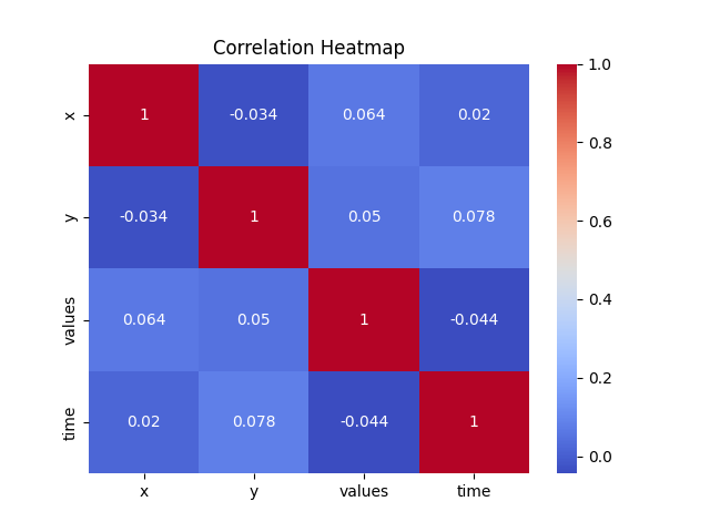
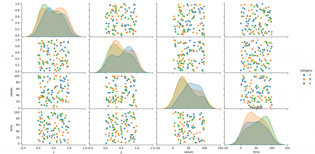
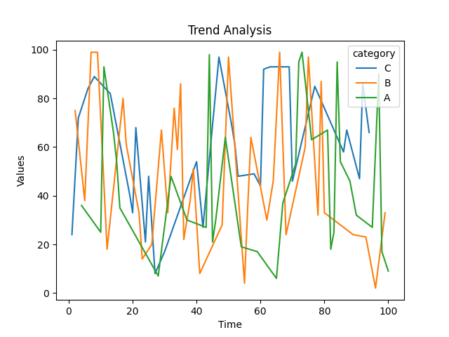
The code provided is a Python script that generates a random dataset, saves it to a CSV file, and then loads and then performs the correlation heatmap, pairplot, and trend analysis.
- The correlation heatmap visualizes the correlation between different variables in the dataset.
- The pairplot displays pairwise relationships between variables, with different categories distinguished by color.
- The trend analysis using a line plot showcases the change in values over time, with different categories represented.
Code Explanation
The code generates a random dataset, creates visualizations, and performs trend analysis. The following steps are executed:
Step 1: Importing the necessary libraries
- The necessary libraries are imported:
- The pandas library is imported as pd for data manipulation.
- The seaborn library is imported as sns for enhanced visualizations.
- The matplotlib.pyplot library is imported as plt for creating visualizations.
- The numpy library is imported as np for numerical operations.
Step 2: Generate random dataset
- A random dataset is generated using the np.random functions.
- Two arrays, x and y, with 100 random numbers between 0 and 1 are created.
- An array, values, with 100 random integers between 1 and 100 is created.
- An array, categories, with 100 random choices from [‘A’, ‘B’, ‘C’] is created.
- An array, time, with values from 1 to 100 is created.
Step 3: Create a DataFrame
- A DataFrame named ‘data’ is created using the pd.DataFrame function.
- The arrays x, y, values, categories, and time are combined into a dictionary and passed as the data argument.
Step 4: Save the DataFrame to a CSV file
- The DataFrame is saved to a CSV file named ‘dataset.csv’ using the to_csv method of the data DataFrame.
- The index is set to False to exclude the index column from the CSV file.
Step 5: Load the dataset
- The dataset is loaded from the ‘dataset.csv’ file into the data DataFrame using the pd.read_csv function.
Step 6: Correlation heatmap
- A correlation heatmap is created using the sns.heatmap function.
- The correlation matrix is calculated by dropping the ‘category’ column from the data DataFrame.
- The heatmap is annotated with the correlation values using the annot=True parameter.
- The cmap parameter is set to ‘coolwarm’ to define the color scheme.
- The plot is titled as ‘Correlation Heatmap’ using the plt.title function.
- The plot is displayed using the plt.show function.
Step 7: Pairplot
- A pairplot is created using the sns.pairplot function.
- The ‘category’ column is specified as the hue parameter to differentiate the categories.
- The plot is titled as ‘Pairplot’ using the plt.title function.
- The plot is displayed using the plt.show function.
Step 8: Trend analysis
- A line plot is created using the sns.lineplot function.
- The ‘time’ column is used as the x-axis variable, the ‘values’ column is used as the y-axis variable, and the ‘category’ column is used as the hue parameter.
- The x-axis is labeled as ‘Time’, the y-axis is labeled as ‘Values’, and the plot is titled as ‘Trend Analysis’.
- The plot is displayed using the plt.show function.
Conclusion
Exploratory Data Analysis is a crucial step in the machine learning process that aids in understanding the dataset, identifying patterns, and gaining insights. Python, with its rich ecosystem of libraries, provides powerful tools for performing EDA tasks efficiently. By leveraging data visualization techniques, statistical analysis, and exploring patterns, you can make informed decisions in the subsequent stages of the machine learning workflow.
Machine Learning In Python Beginner Tutorial Series
- Machine Learning Part 1: Introduction
- Machine Learning Part 2: Understanding Data Preprocessing For Machine Learning
- Machine Learning Part 3: Exploratory Data Analysis for Machine Learning
- Machine Learning Part 4: Introduction to Supervised Learning Algorithms
- Machine Learning Part 5: Introduction to Unsupervised Learning Algorithms
- Machine Learning Part 6: Evaluating Machine Learning Models
- Machine Learning Part 7: Deep Learning and Neural Networks
- Machine Learning Part 8: Natural Language Processing (NLP)
- Machine Learning Part 9: Recommender Systems
- Machine Learning Part 10: Model Deployment and Productionization
 Mens Winter Single Breasted Big Pockets Mid Long Casual Coats
 Mens Contrast Patchwork Flap Pocket Decoration Short Sleeve T-Shirts
 Orange Pi 800 Development Board 4GB RAM 64GB
 Mens Casual Corduroy Hooded Button Pocket Comfy Shirts
 E500 1.83 inch HD Screen ECG Monitor Heart Rate Blood Pressure
 35L Outdoor Backpack Men Women Waterproof Travel Trekking Backpack
 Home Steam Sauna Box Steam Room Fumigation Machine Steam Sauna Bath Sauna Heater
 GPD WIN Max 2 LPDDR5 32GB RAM 2TB SSD AMD R7 6800U Windows 11 Gaming Notebook 10.1 Inch Laptop Portable Game Computer Handheld Game Console US Plug
 SKYLOONG GK64X GK64XS Keyboard Kit RGB Hot Swappable 60% Programmable bluetooth Wired Case Customized Kit PCB Mounting Plate Case with Replacable Space Key